Telefónica I+D (R&D) corporate website looked dated for a company that wanted to embody web standards and best practices, so a structure and content redesign was requested.
What
Telefónica I+D (R&D)’s website (www.tid.es) had seen its last update in the late 2005 and it was starting to show. Web standards and best practices had been evolving in the last years and it was time for the corporate site to update.
The old site reflected the company’s structure, with technical terminology and clever names being used as navigation labels. Content was to be kept as it was deemed as important, but the text was verbose and formatted in long paragraphs with few headers. Common tasks (like looking for the business address or applying for jobs) were obscured under complex navigation and long instructions.
The new site was simple, easy to use and maintain, and consistent.
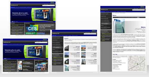
- Web standards compliant: logo on top left which doubled as anchor to home, big search box on top right, horizontal primary navigation with dropdowns and secondary vertical navigation on left sidebar, big image slideshow on homepage with several modules underneath…
- Simple navigation: labels were created from common vocabulary (“who we are”, “what we do”, “work with us”…), next level navigation was always visible with no exploration needed, shallow information architecture (three levels deep maximum), breadcrumbs were used.
- Web-formatted content: shorter copy, headlines, bold highlights, lists of elements… while retaining the original substance.
- Consistent: layout was standard and pages were built with modules that could be easily re-used and replaced.
- Quick links: shortcuts to commonly accessed pages were “floated” to the home page.
- Easy and cheap to maintain: it was built using open source CMS Drupal.
My work
Met with different stakeholders and real users separately to understand the site’s goals from their point of view.
Conducted competitive research on other research and development websites, looking for standards in layout and navigation.
Created a content inventory and checked with stakeholders what was considered critical and what was possible to update, re-format, or let go.
Built “user profiles” based on limited research.

Used the “user profiles” and the content information to create an Information Architecture that would support different user’s goals, while keeping the critical content and detecting where further content could be needed. Card sorting was used to help find labels and organise the site.

Hand-drawn wireframes were created for the different pages in the Information Architecture and shared with the Visual Design and Development teams.


Formatted content for the web: reduced and simplified text (30%-50% less words), highlighted important keywords, used bulleted lists and white space.

What I got
- Experience with Information Architecture for a corporate site, including card sorting.
- Copy-writing experience after reviewing and re-formatting lots of text content.
- Knowledge on how to create a consistent site that has to answer different people’s needs and goals.