I have been having problems with my blog’s fonts since day one. I am all into the idea of CSS3 web fonts, and being a humble little blog I was looking for some nice free fonts hosted on external reliable servers that would support the “wireframy” look of the site.
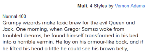
I browsed Google’s webfonts service extensively and found a couple of fonts that I really liked. Permanent Marker had that bold and rough feeling of quick handwritten titles in sketch wireframes, and Muli was a lightweight paragraph font that added to the “airy” look of the site.

I designed my site using these fonts, and was quite happy at first. But then, with cross-browser testing problems arose.
First, Permanent Marker would not look good in webkit’s Chrome (due to sub-optimal anti aliasing) and older versions of IE (which I do not really care about a lot). I have been looking for alternatives, and though I have found a couple I really like and might suit the deed I do not think they would look great in Chrome anyway. Maybe some next Chrome version would offer better anti aliasing support? We’ll see, and I’ll keep playing with title fonts for a while.
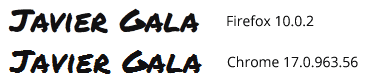
The problem with Muli was different; Opera Mobile 11.50 would not display “strong” text. You see, even though there is a Muli bold version it has not been offered on Google webfonts service yet. Therefore, browsers were creating faux bold characters “on-the-fly”, and it seems Opera would not display them. I tried some solutions but none seemed to work and I ended up filing a bug at Opera. A pity, because I think Opera Mobile is the best browser for Android smartphones. I was worried but I thought I could live with that.
Things got worse. New Opera Mobile (11.60) launched earlier this week, but the problem with Muli was still there. Moreover, I noticed something with Firefox. I suddenly realised the bold characters were gone in Firefox as well! Maybe has to do with the 10.0.2 update? I am not sure, but Firefox really matters to me. My advice: be very careful with faux alternative font weights with web fonts!
So, tl;dr, I changed body font to Open Sans. It is a little heavier than Muli, but nice and elegant. Moreover, it comes with bold weight version, so I hope there will not be any problem with that. Expect some other typographic changes to this blog in the near future… particularly now that The Elements of Typographic Style is in my reading list!
I'm pretty sure the problems are related to Windows, more than the browser itself. I've tried the site in Chrome on Mac OS X and the fonts look perfectly aliased. Maybe they get away with it because Windows users have a higher tolerance to crappy fonts :).
There’s also a slight problem when you hover over question marks with the Permanent Marker font. Try it. it looks kinda weird on Google Chrome mac.